Ibotta
IOS | ANDROIDSearch & Discover
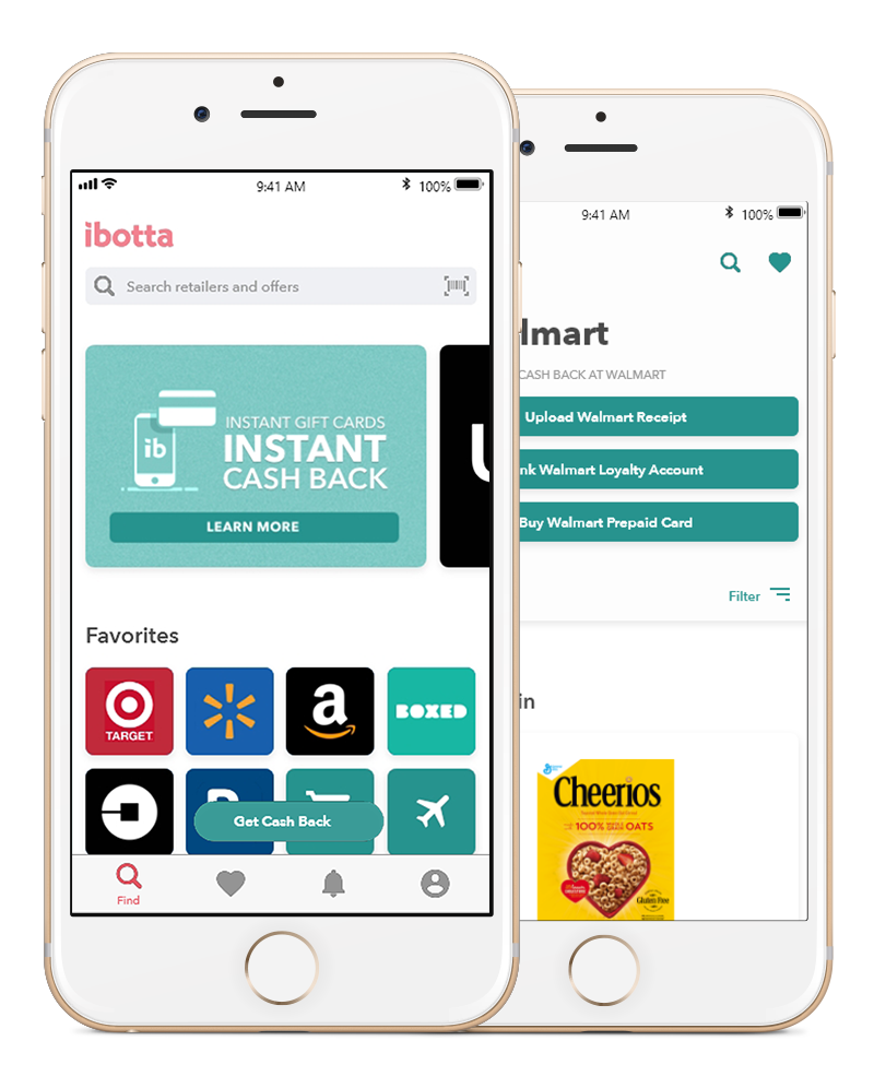
Ibotta’s previous search experience was essentially non-existent, not many users used it after the first time they attempted to use it. A strong search and discover experience in any product can address many usability issues by providing an interface for users by simplifying navigation and discovery. A useful search function can accelerate the speed in which users can experience the app and provide a quick was for new users to quickly engage with the products. Before pencils hit paper, we interviewed users to get insights about what users thought about the previous search experience. After learning about what frustrated users and what they liked on other experiences, we decided to focus our efforts on key sections that designs would need to address. These included creating a more visible search point of entry, reducing user efforts for recall, helping users easily find and browse inventory, providing information clearly and fast, as well as exposing features and products they may not be aware of within a simple and common sense workflow.
My Role
Led the overall design effort from start to finish for search and discover ux, research and testing. Every step of the process, progress was reviewed and critiqued by the design team, product managers and stake holders. Engineering reviews were consistent at important points in the process to determine feasibility of design concepts all the way to final development.
In collaboration with:
Rini Chica: PM
Kevin Carlyle: UI, Design System
Amanda Shares: UI
Research
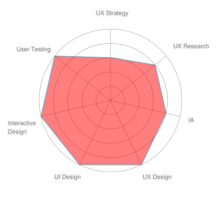
We interviewed 5 existing users to gain more insights about why they were not using the search function in the app. We also asked them to show us examples of other apps they use and share with us what they liked about how they search and discover products on other apps. The insights gained from these interviews shaped the direction we wanted to take when devising the strategy for a new search and discover experience. Interviews were conducted in person with existing users based on the companies ideal demographic with a product manager and myself as a ux reseacher.
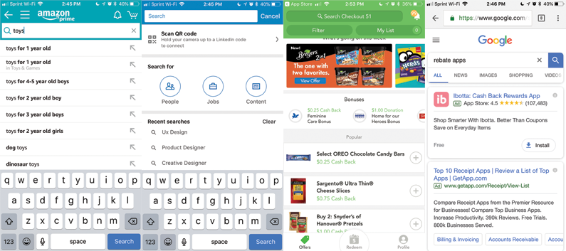
Along with interviews, I performed many direct and indirect competitive analysis of apps in the marketplace. Some of these were apps that users mentioned they really liked. I wanted to get a first hand account of what it was like to use some of these apps by actually using them first hand.
Problem Space
Insights from the research were used to determine the direction we would take for the ux strategy. Some things were clear right away. The search experience in the app lacked some of the most basic best practices when it comes to search ux. It was also very clear that the app was behind some of its competitors. to address these usability issues we defined specific areas that we had to solve for based on user interviews.
- Search needed to be more visible, often overlooked by users
- Bar-code search was not recognizable by users and didn’t know it existed
- Search relevancy needed to be be improved, users couldn’t find what they were looking for
- Auto suggest was a feature greatly needed to help users find things faster, users weren’t aware of the inventory
- Users often encountered dead ends when searching for most things
“I never really used it again after the first time, there were better ways to find things on the app”
“I had no idea that you could use bar code scan to find a product.”
“The results I got after performing a search wasnt what I was looking for.”
“Its faster to just browse to app to find what I was looking for.”
Concept Development
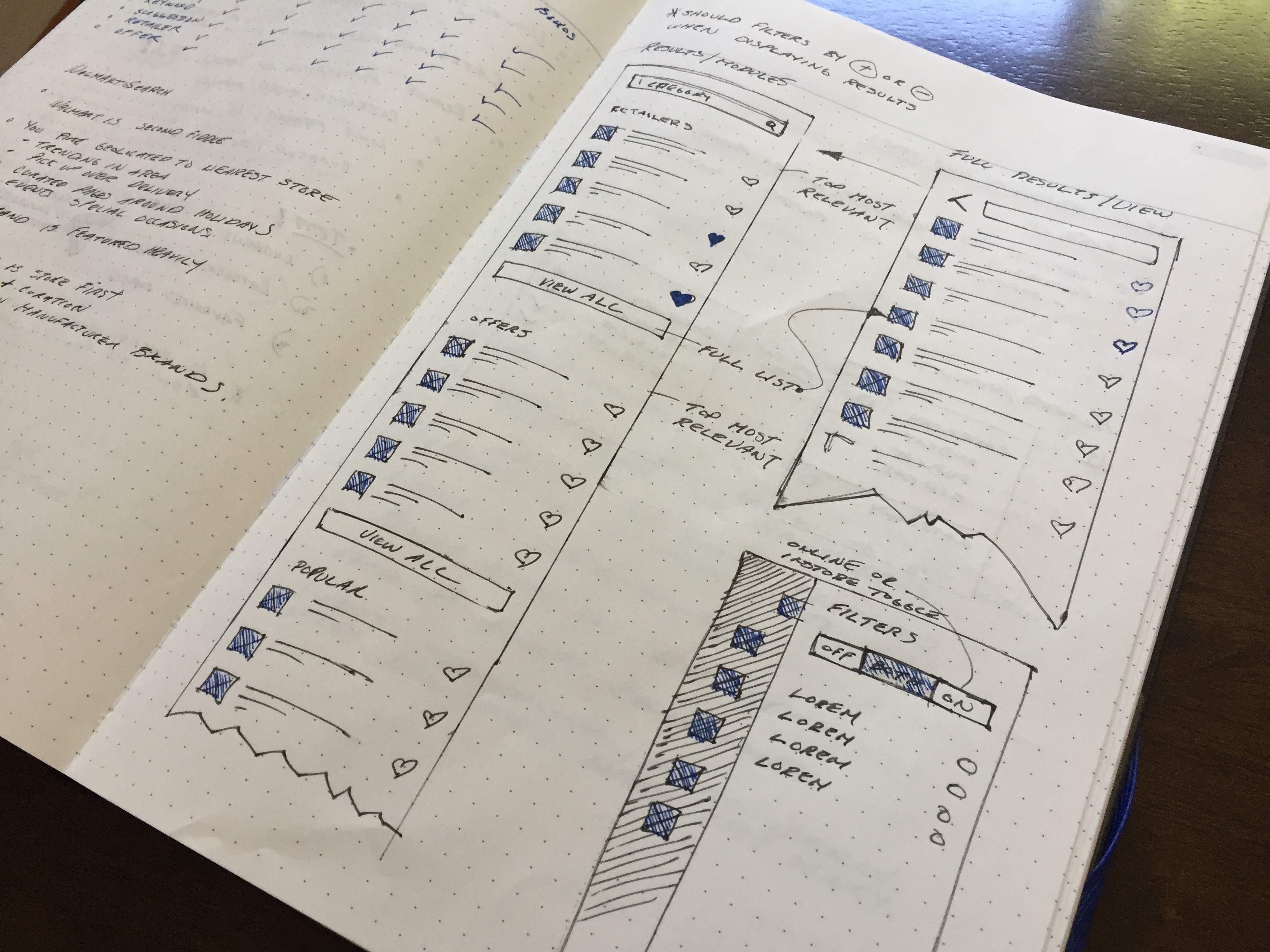
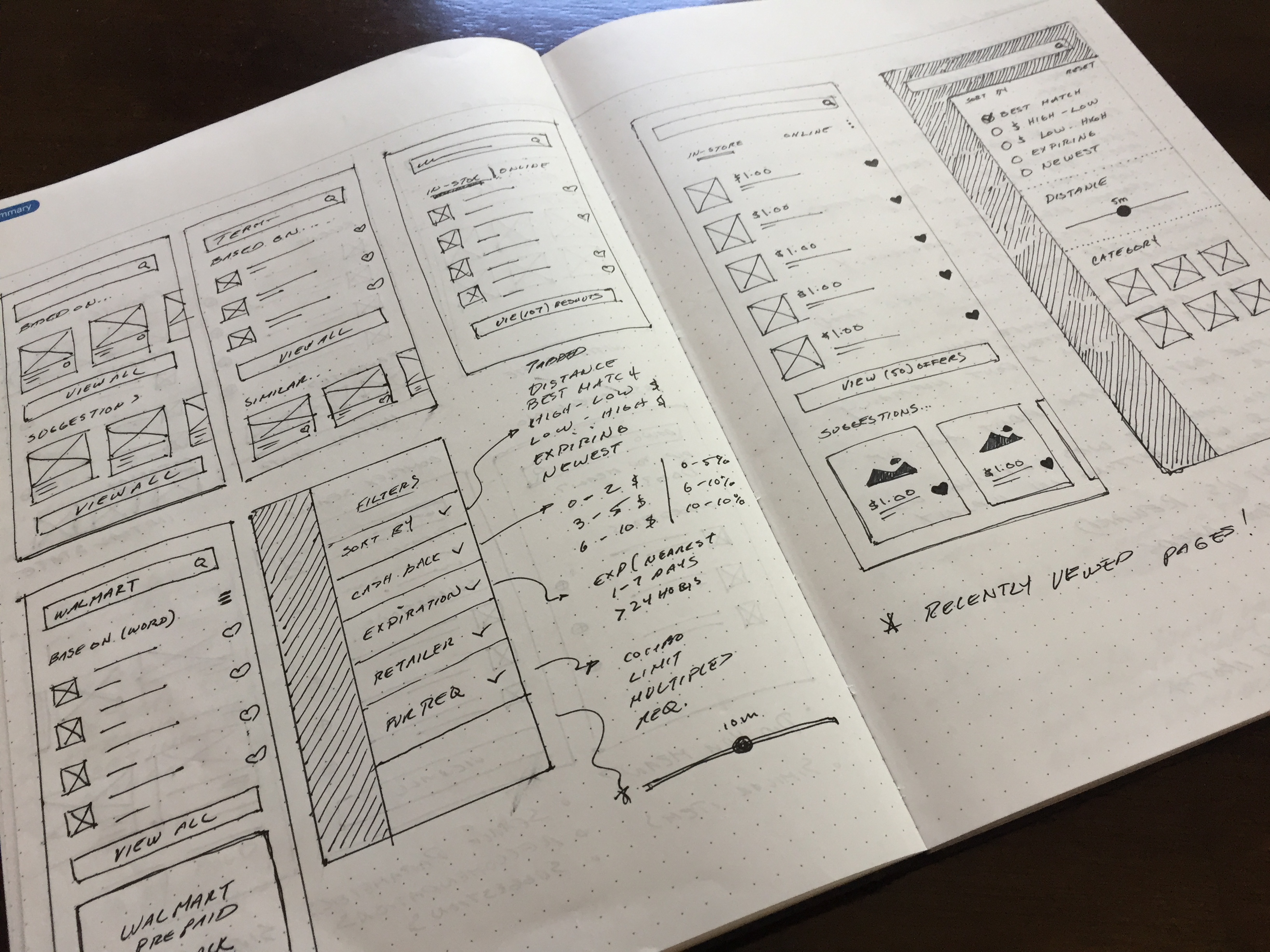
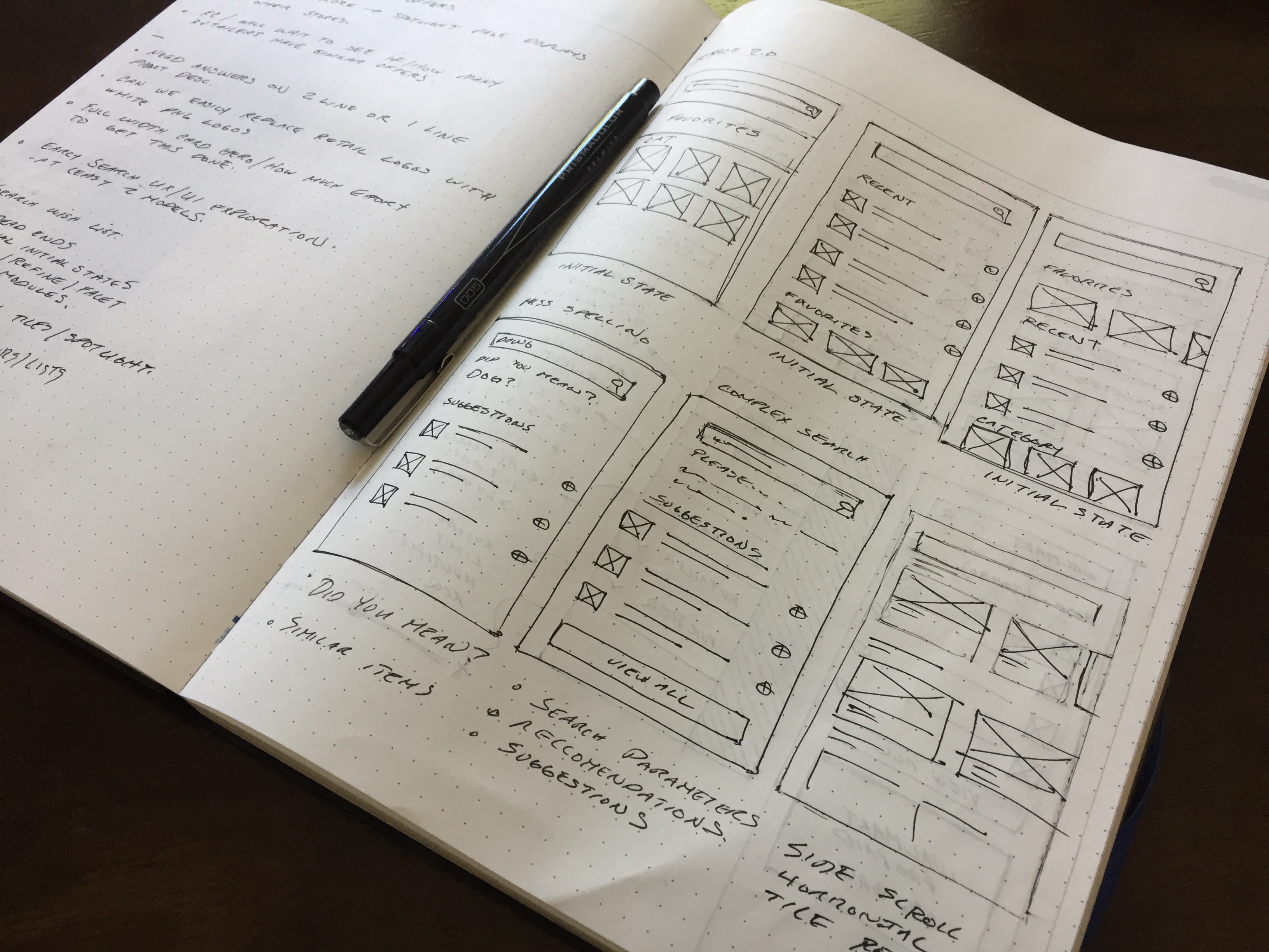
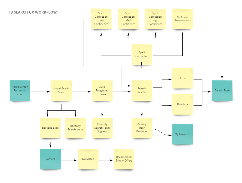
Once the user goals and problem areas were identified I began to work on some ideas. My initial approach is to first map out an workflow that addresses the areas of improvement that needed to be be solved. I went through a series of diagramming workflows that presented the path to lease resistance. A path that when engaged by a user feels like common sense and can immediately start using. I started with sketches in order to get ideas with a focus on simplification and simple patterns.
Concept Refinement
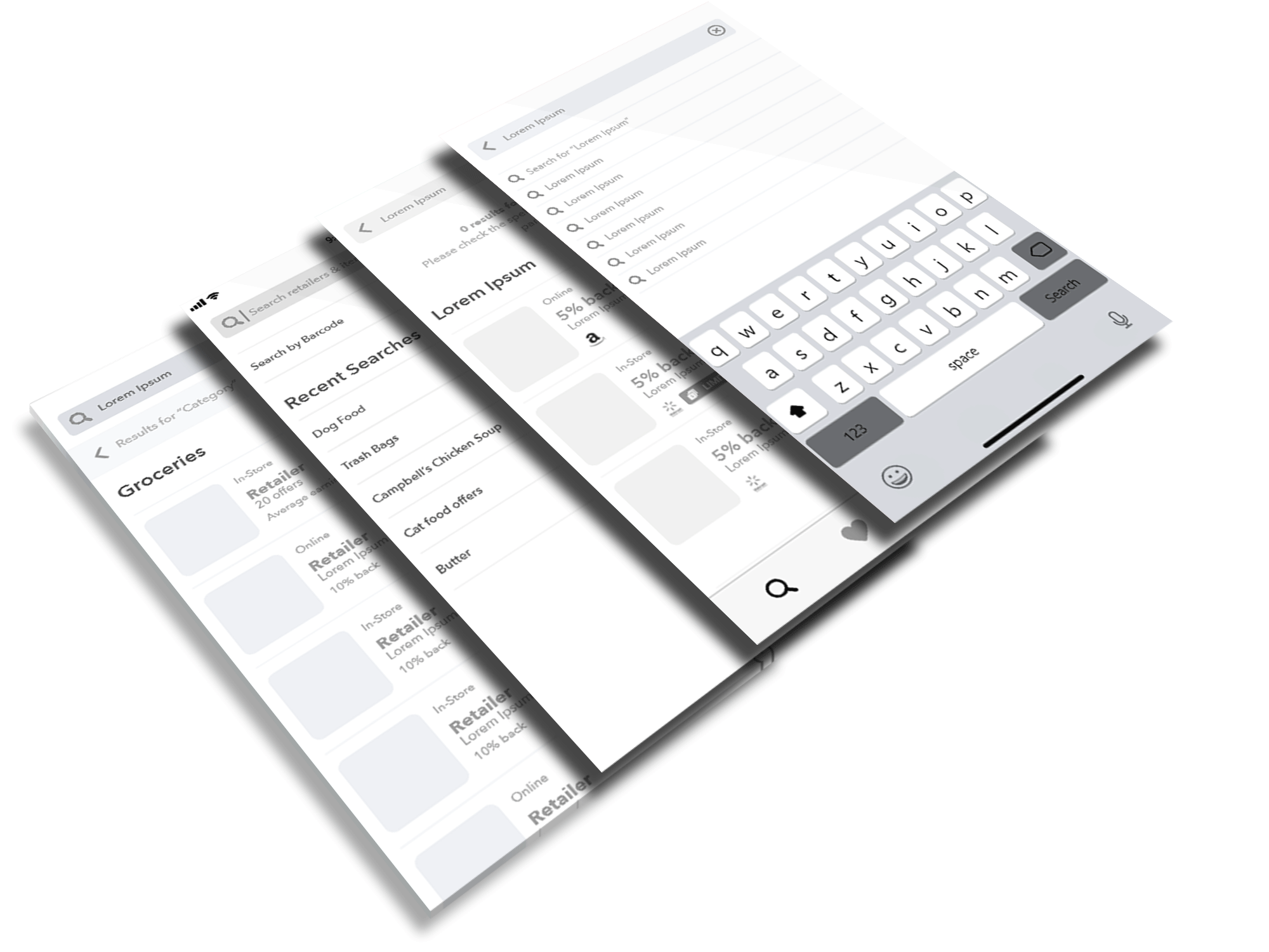
Sketches and workflows were translated into wireframe concepts to further solidify ideas and create an early prototype to be use to gain early insights through some early testing. User feedback and insights from testing were used to improve upon concepts until there was enough confidence to move forward with finalizing the designs.
Search & Discover Visual Design
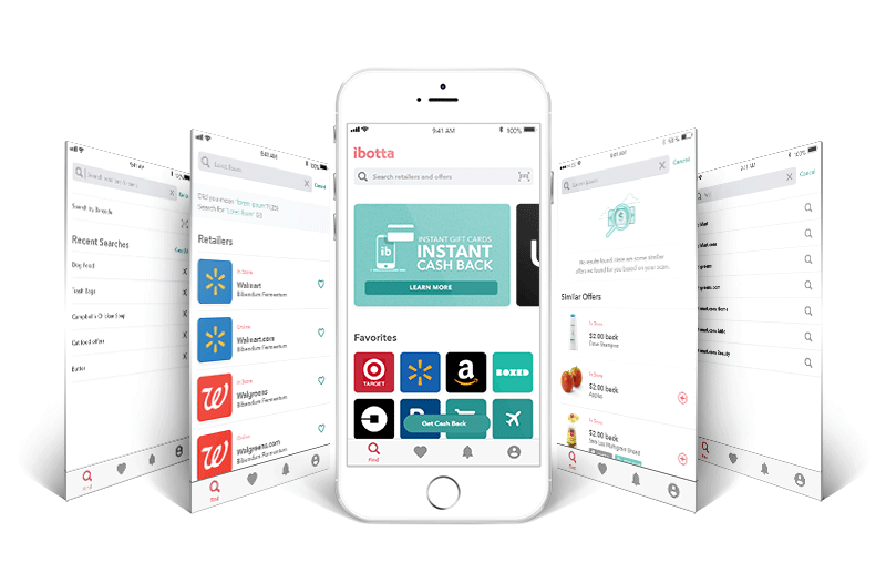
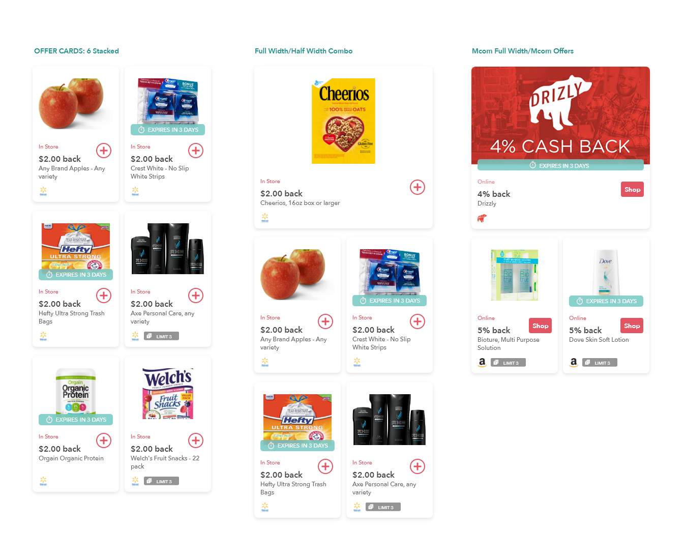
The visual design for the company is a constant work in progress. Continually making improvements based om user feedback and testing, the style guide evolves in design with every iteration. The interface for search and discover was crafted using existing UI design system components crafted by the design team. New UI elements were created when a need arises, but each version was tested before implementation. Much of the new UI components such as signals or gallery product cards were redesigned to improve user recognition and scanning when users are looking for items in the app. Multiple iterations of signals such as metadata presentation, signal badges, call to action buttons and icons went through extensive quantitative and qualitative testing before landing on a design that was ready.
Motion and Interaction
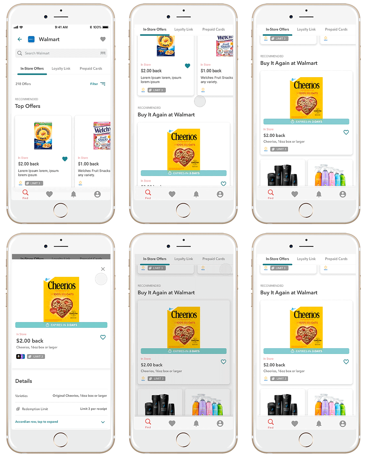
Subtle use of motion are used through out the UI with clear indication of purpose to show the user the progress of their actions within areas of the app.
Viewing Product Details
Transition to details page after user taps a product card.
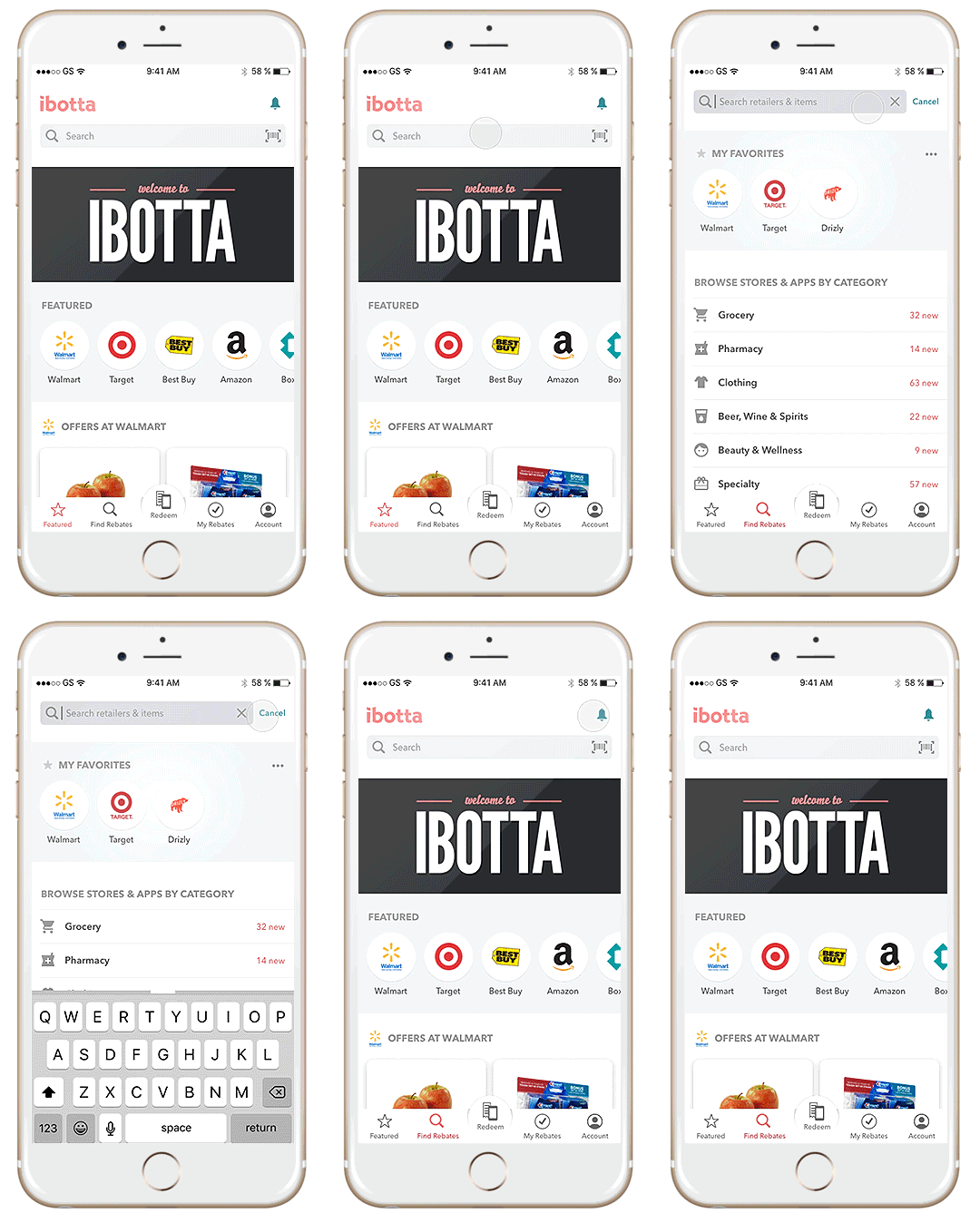
Performing a Search
Interaction and transitions for search function.
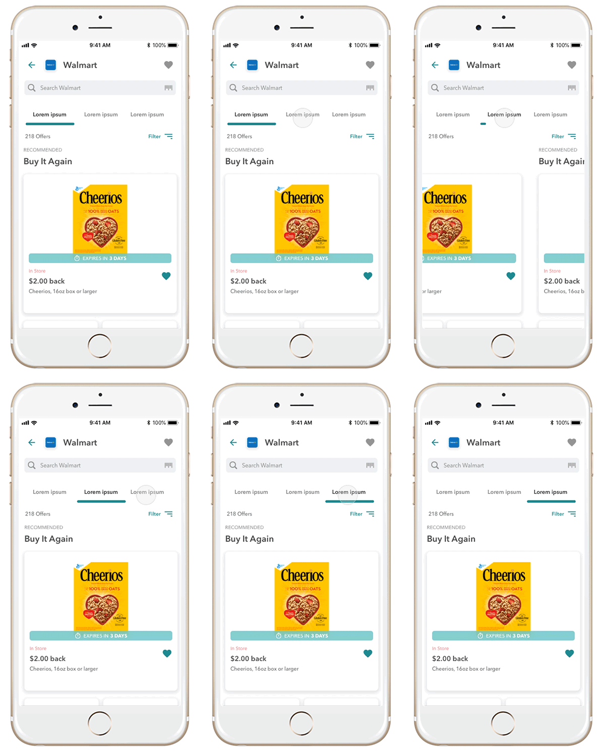
Navigating Tabs
Tab and page transitions to navigate through retail galleries.
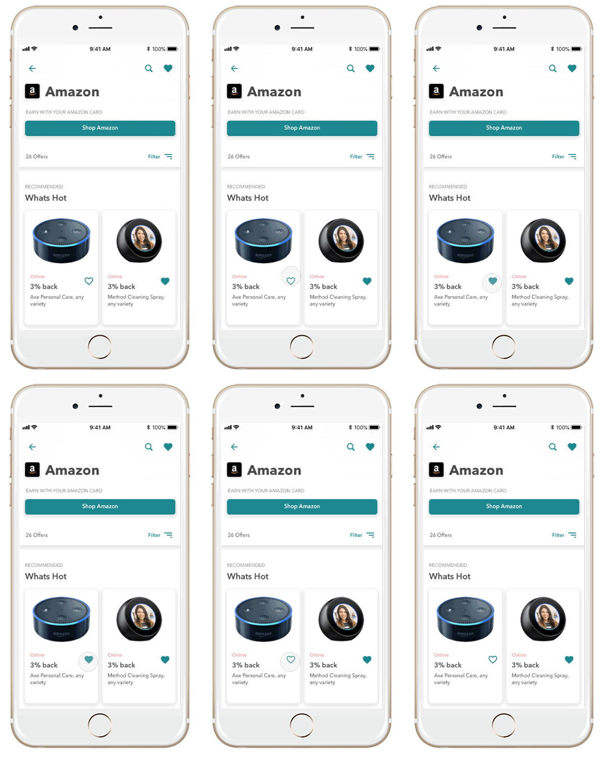
Saving a Product
Simple heart indicator to show user has added a product.
Current Status, 2018
The work is constantly being tweaked, tested, and improved upon via improvements in design, search algorithm’s, system taxonomies to further improve the users ability to find products quick and easy. The new search and discovery experience has already started to greatly improve the users ability to find items they need as well as providing the ability for the product to scale properly as inventory increases.
