Ibotta Business
WEB | MOBILEibotta Business Solutions
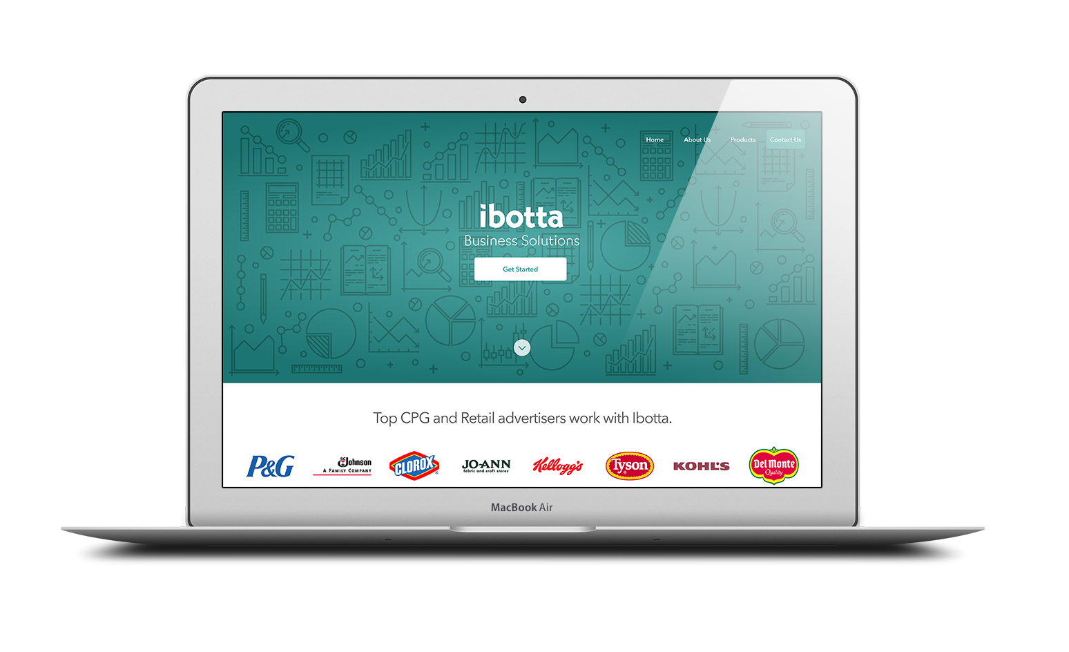
Ibotta Business Solutions is the B2B facing point of engagement for existing and new clients for the company. It’s used as a source for people to learn more about the company’s products for marketing and advertising. The Current site lacks the proper information need by most clients and the site currently goes unused today. The company is growing at a very fast pace, adding new clients on a daily basis to address the needs of sales and marketing teams, we needed a new strategy around how we present products to our clients.
My Role
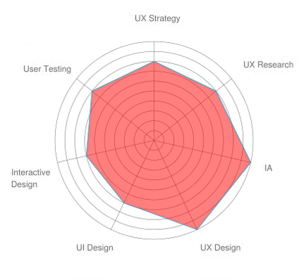
The project was a collaboration between myself and another designer. Going through the proper design process we planned, we implemented the steps of first determining the problem areas, interviewing individuals on sales, marketing and analytics to learn more about their goals for the company and Interviewing clients. Surveying of the competitive landscape before we starting the work for ux strategy and design.
In collaboration with:
Steven Parisi: Product Designer
Research
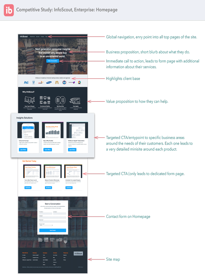
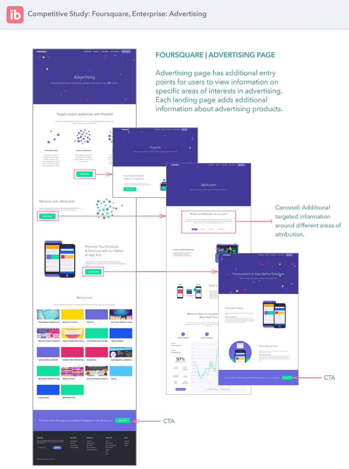
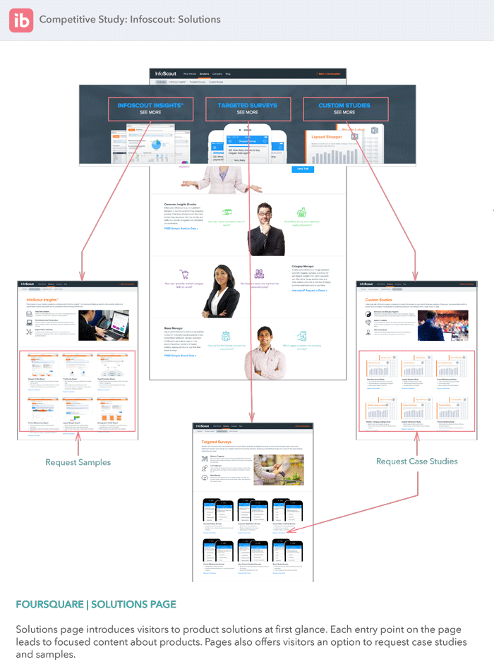
The discovery phase of the project first began by interviewing internal employees to determine the needs and goals of what they want from a B2B facing website. These interviews were also used to determine the legal and content requirements that needed to be displayed on the site. We also interviewed clients to learn more about why they were visiting the website, we wanted to learn the kind of information they were looking for, pain points they experienced during their visits and other things they felt would help them about learning about the company and its products. A competitive analysis was also completed in order to make sure the new designs were addressing any advantages being offered by similar companies. Some of the findings for the analysis was also used to inspire ideas for the new designs.
Problem Space
Most of the companies potential clients that were new or existing did not have a reliable source to learn about the company, it products and value propositions. They needed a source that was easy to access and help them make informed decisions about their marketing needs and how they could work with ibotta to fill those needs.
The interviews helped define the design goals and problems we wanted to create solutions for. It became clear that the site lacked the structure and content needed to be effective to function as an initial information hub for what the company is about, it’s products and services, value propositions and points of contact.
- The site was full of repetitive information, much of it was very difficult to understand even by marketing managers who visit the site for information.
- The site navigation was too linear, the process of discovery for a user would lead to dead ends or information that was not helpful.
- Product descriptions advertising and marketing products were disjointed, clients has difficulty in understanding how these services worked and why it would benefit them.
- The use of imagery were often unrelated to the products being displayed.
- Site was not SEO optimized and buried within the corporate site making it difficult to find.
- There was no navigation
- Sale representatives wanted to be able to use the site as an informative tool for potential clients.
- No clear was of contacting the right channels for clients.
“Our site feels dated compare to other sites in our industry.”
“The information for our products and services do not highlight our value propositions.”
“We want to be able to use this for clients that are inquiring.”
Concept Development
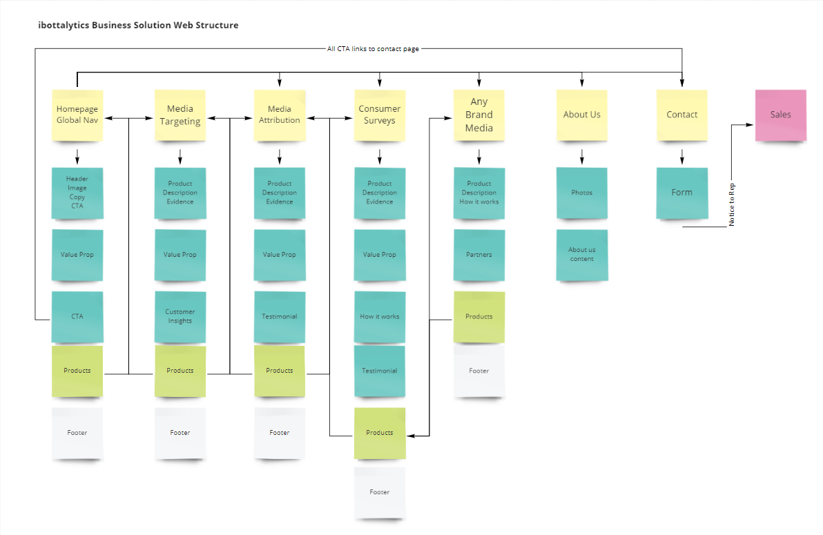
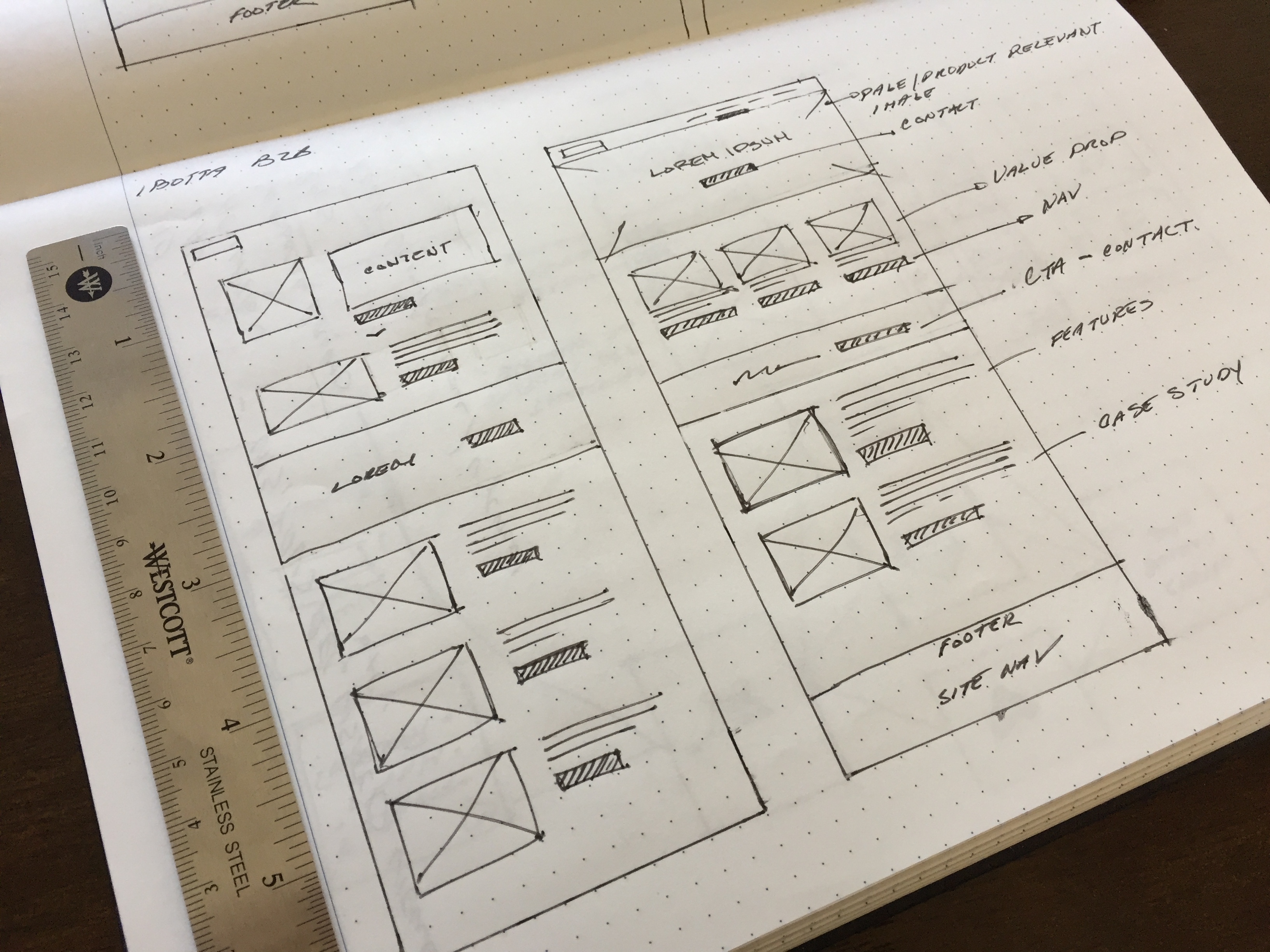
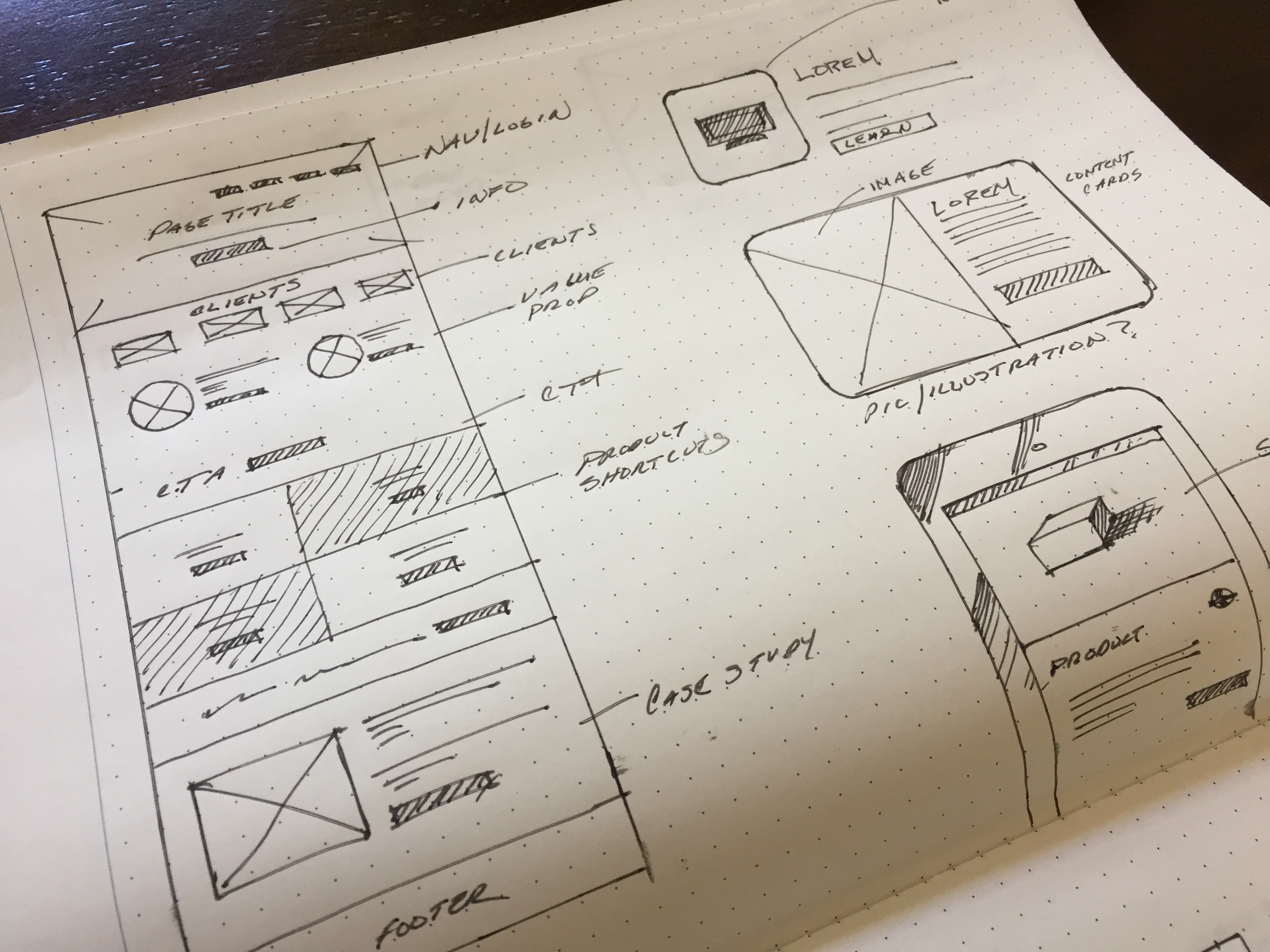
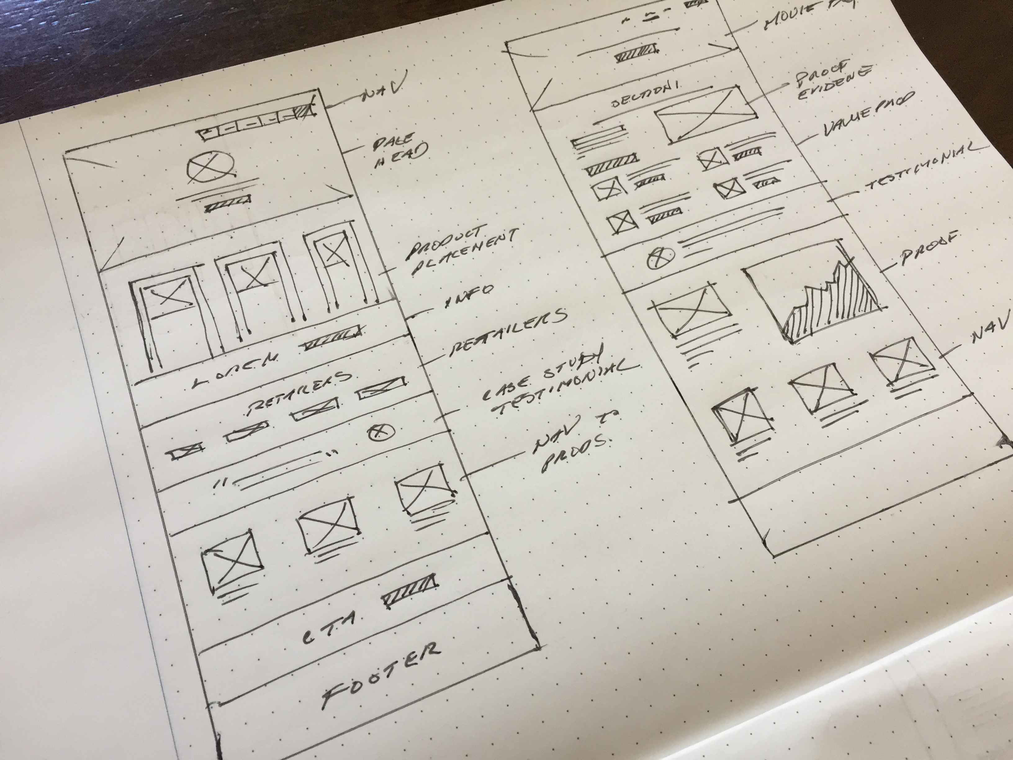
The process began with the exploration of the competitve landscape, learning from what we liked that similar site were doing and taking inspiration from things that we liked. We started by first mapping out areas of the workflow that was crucial to stakeholder needs and requirements. Identifying these areas of importance allowed us to iterate on ideas on site structure with the most important user content in mind. Once an initial workflow concept was idealized I began sketching out potential page layouts that would create sections for each type of content that were identified as important for the users. These included sections for: product pages and descriptions, value prop, evidence, case studies, call to action, testimonials, articles, graphs and charts.
Concept Refinement
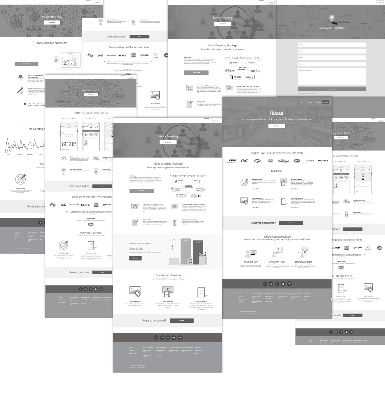
Sketches and workflows were translated into wireframe concepts to further solidify ideas and create an early prototype to be use to gain early insights through some early testing. User feedback and insights from testing were used to improve upon concepts until there was enough confidence to move forward with finalizing the designs.
Usability Testing
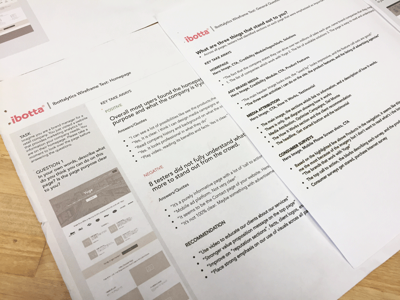
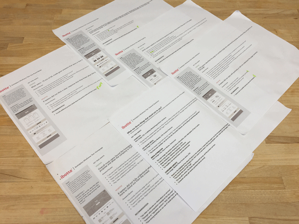
Prototypes and screens were used to get feed from clients who had volunteered to test well as quantitative testing done online with testers that matched the profile of a marketing manager. Usability results provided the data needed to finalize designs.
Visual Design
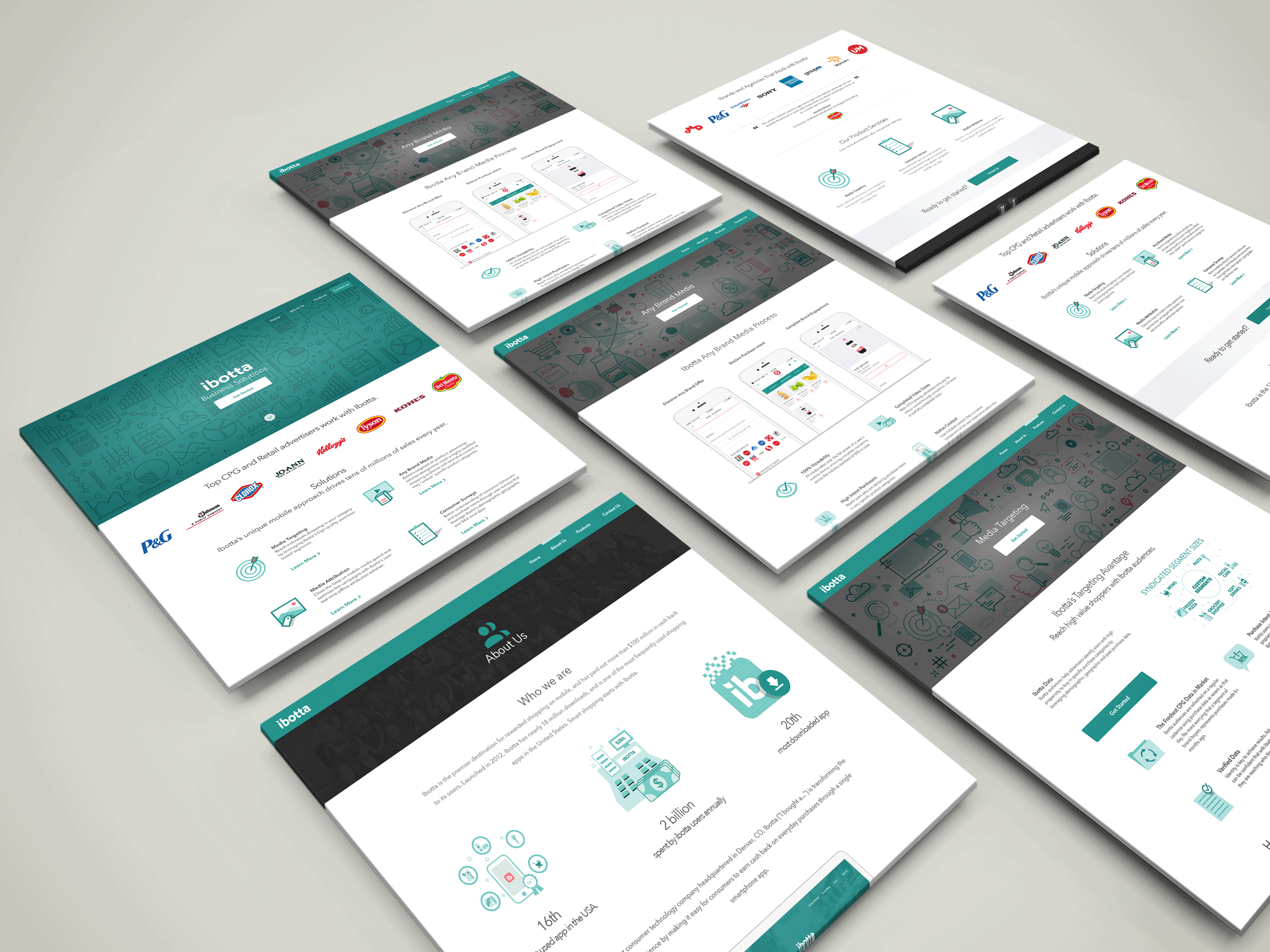
We chose to go with a very lighthearted direction with the overall visual design of the website. Illustrations were used to create the feeling of a fun atmosphere similar to the game like experience users expect from the ibotta brand. The use of illustrations were used across all page of the design from product page headers, product symbols and value propositions. Cognitive load for each page was also taken into consideration when drafting copy for each page section and to focus on getting the important points across first. The expectation is that a user arriving anywhere on the page will know exactly what they are looking at and that their expectations will be met when they arrive. Navigation is clearly visible anywhere on the site and allows users to jump from one product page to the next without ever feeling lost.
